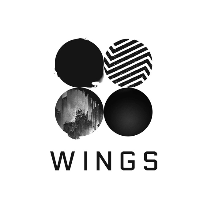
BTS – “Wings” Album Cover
Released October 10, 2016 by Big Hit Entertainment
This iconic album cover is memorable because it uses the principles of contrast, repetition, alignment, proximity and color to tell us something about the album itself before even listening to the songs. 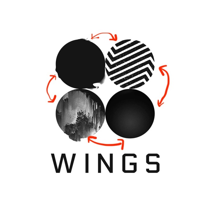 The cover not only uses contrasting colors, black and white, but also uses contrasting patterns in each circle. Even though the two black circles look similar at first, the contrast of the two the circles around it makes you pay attention to the negative space and realize that one of the black circles is misshapen. This makes for a very striking image, because it makes us pay attention to what is inside each circle.
Although there are some differences in the circle shapes, the basic circular pattern is the same. But artist not only repeats the circle pattern, but also the white space (empty space) around it. This could also give the impression of “wings” like that of a butterfly.
 The cover is all centered aligned, and although this alignment can appear “weak” because it is not as striking as right or left alignment, I think it is a good choice for an album cover. The visual connection between all the circles and the title is clear, and it allows for the focus to be on the circles themselves. Although not obvious in the design alone, fans will know that BTS uses these designs in every music video released from this album, further strengthen the importance on focusing on the circles.
The letters and circles are also all very close to each other to reinforce that connection. Notice all the empty space, even though nothing is there, it encapsulates the important information we should get out of the album cover. This makes the circles and words become a visual unit using proximity.
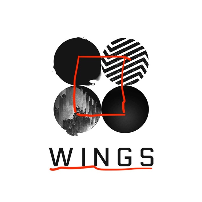
Although the “Wings” album cover is mostly black and white, there are certain deliberate choices to make us pay attention. All the surrounding circles us these same colors to create gradients and different grey tones. Also, with the title of the album being black, it also helps us create that connection. If the words were in a different color, the connection would be broken and the tittle would stand out more than the images.
Finally, this album cover uses the elements of contrast, repetition, alignment, proximity and color to produce a striking image that makes us pay attention. The whole image is a contrast of black and white, but this makes us notice the small details and clues put into album cover, with the help of the contrast. Usually, centered alignment can have a boring look, but because of the use of negative space it makes us pay attention to the different connections of each circle. The proximity and equal spacing of the circles also reinforces these connections. What at first glance looks like a simple design makes for one that makes you wonder what the album is about, and that is exactly what the artist was going for.