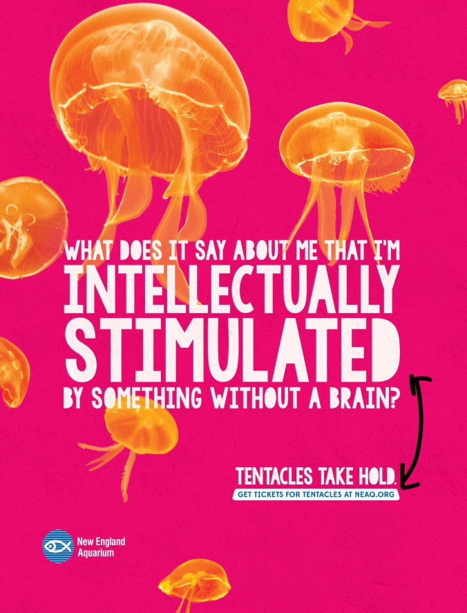
The main font is used in both, so you know you have to read them together and from left to right, but the biggest text is what you will read first. 
The alignment also plays a big factor in this, even though the ad is centered aligned, the other text is right aligned so your eye follows that and reads it.
This is my attempt at making an using similar principles:
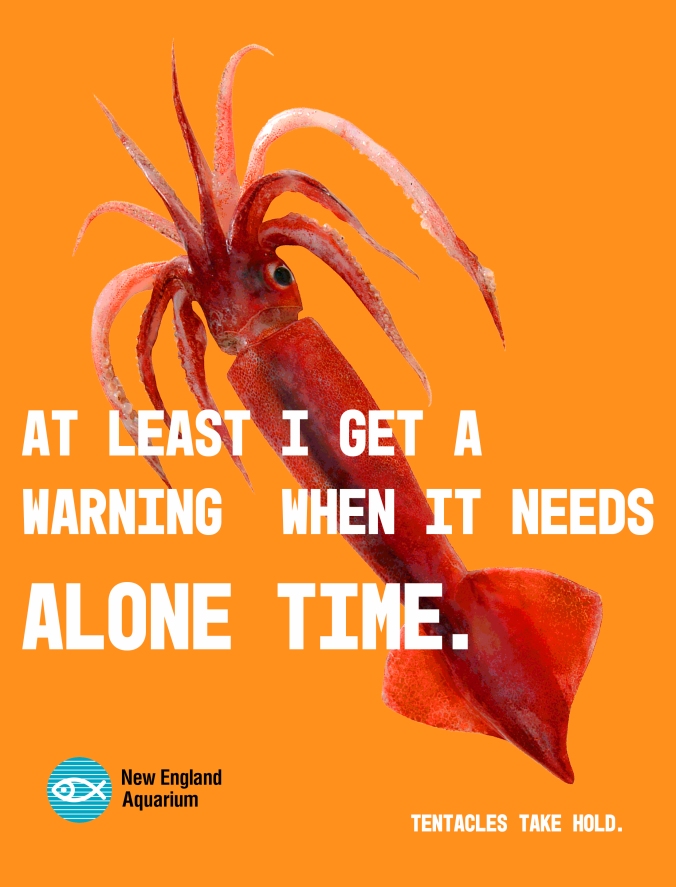
The thing I really wanted to get right was the use of color and contrast, the squid being red and the background being orange are still bright colors, but the first thing that jump out is the white text.
After that I worked on getting a similar font to the one used, and I wanted to try left aligned text instead of right aligned for a stronger look. 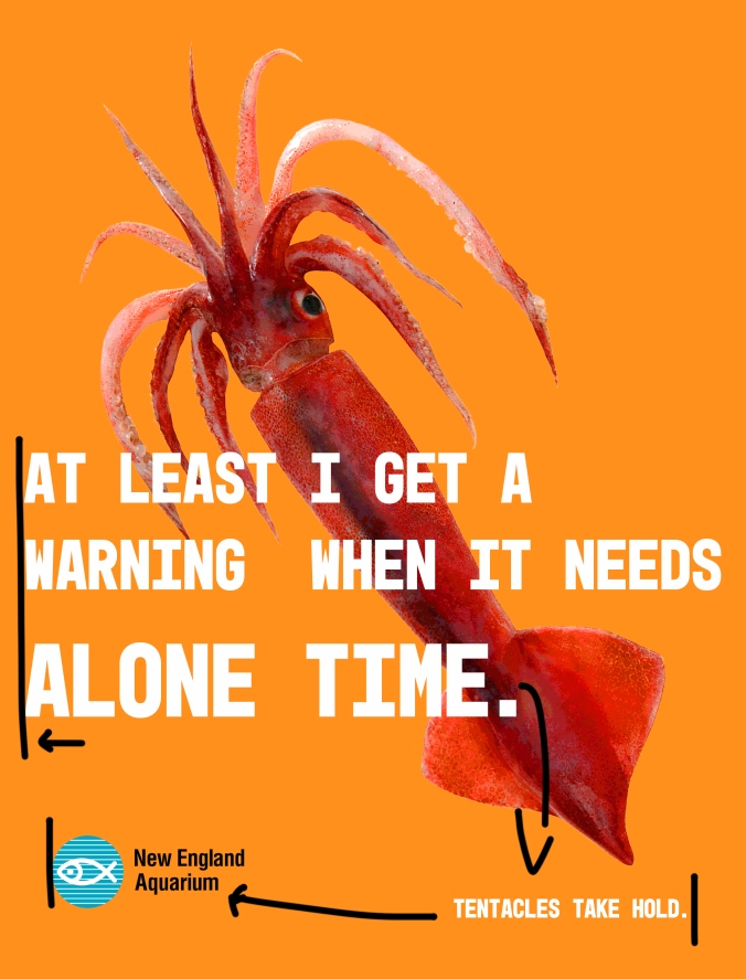
The use of repetition and proximity, just like in the last ad, help the reader to continue and read from left to right.
I personally felt that doing this helped me understand what goes into an ad campaign and how designers focus on making something not only to grab our attention but also to make things easy to understand and convey.